A quarter of a century is a long time for anyone. Still, time passes so quickly. As attentive, as watchful, and as careful as one might be, time slips away. Time is measured and exact, yet it is so much more significant by way of its seeming-ness than in its actual-ness.
It seems both a long time and a short time since I came to the Chapel Art Center, first as an assistant, then as director. The predominant sentiment, at this point, is more than an indistinct gratitude; it is a mesmerizing wonder at the tremendous privilege it has been. Whether by way of the hurried, early morning slip up the back stairs into the office, or an arrival through the glistening glass doors on opening night, the sense of the precious and sacred here has never eluded me. From the very beginning, the history and distinctiveness of this Maginnis and Walsh chapel, designed and built nearly a hundred years ago, offered me an all-embracing invitation—a demand almost—to further cultivate the beauty of this environment. Hovering over my head each day, the magnificent mural paintings by my own monastic forbear, Father Raphael Pfisterer, O.S.B., have called to me to “ora et labora”—to pray and work —at making progress in the usefulness and power of art.

The greatest surprise to me has been how art draws upon so many ideas. There is hardly a topic I can think of that does not involve art. Years ago, we formed an “Art and…” lecture series at the Chapel Art Center, wherein a diverse group of faculty from a variety of academic disciplines, offered lectures on art in relationship to other subjects. I thought it would be very apropos, at this significant anniversary moment, to invite faculty and staff to choose a work from the permanent collection and write an essay to accompany this year’s three-part exhibition series called Dilecta, Reflections on a Permanent Collection. Like students, the essayists would receive an assignment per se, and engage in the exercise of pure reflection, relying simply on their attraction to the work of art.
I decided to call the project Ten Essays. It was not so much the number of essays, but the sound of the title which mattered most. The title alludes to a wholeness, to an even band of friends, a complete group who could witness to the idea that art draws together.
The results are pretty remarkable, insofar as they all fall back on the most basic and natural sense of appreciation. Appreciation begins with that initial draw, that spark of notice, and deep sense of wonder. It ends with a response, the moment when the object and the viewer come together. A person’s appreciation itself enhances the work of art, and in turn, becomes the beauty of the one who appreciates.
—Fr. Iain MacLellan, O.S.B. ’78
A selection of works from Ten Essays
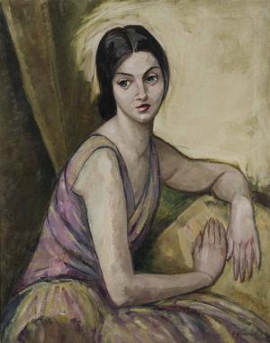
Portrait of a Lady in Lilac and Gold
Oil on canvas, 1915
Elizabeth Grandin, 1889-1970

Father Iain introduces me to a beautiful woman in the gallery. “She’s called Lady in Lilac and Gold,” he says, “but in the wrong light, she can look a little green.” I want to pick up her hand and whisper in her ear, “I know the feeling.” These shifts and unresolvable contrasts in Elizabeth Grandin’s Lady are what make the painting so compelling to me. The Lady is beautiful but wan; she is dressed for a party but sits alone. She is thoughtful but insouciant. She draws me close while she resists being read. She wears a serious face but a frivolous frock.
New Jersey artist Elizabeth Grandin (1889-1970) was the student of Robert Henri, who founded several groups of significant painters, including modernist women artists. The 1915 Lady is one of Grandin’s early paintings, many of which rely on emphatic use of color and expressive impasto more so than formal compositional techniques to depict shapes within a space. Grandin carried on Henri’s influence and progressive philosophies, and in 1925 she co-founded the New York Society of Women Artists with 12 other avant-garde women painters and sculptors. In 2025, the NYSWA will call its centennial exhibitions “Evolution Revolution,” as it celebrates 100 years of supporting women to “prevail with fortitude” and “make art in solidarity.”
Because I study literature, I am often inside a narrative—a formal telling of a plot that charts a character’s actions and development through language. In a gallery, however, I am drawn to portraits of women—unplotted, untold, wordless. I catch the Lady in a frozen moment in time, and I do not know what has happened before or what will happen after this moment. She leaves me to wonder and guess. She shows company her left, lifted side: interested and open, graceful and relaxed, while on her shadowed right she looks within—the right eye a ruse of feigned attention, her arm across her body—forbidding all comers. The realistic, earthy palette, especially around the Lady’s head, pushes the few spots of color to urgency: her evening lipstick, the lilac folds of her bodice. Grandin accomplishes this vacillating mood with new modernist principles of broken form that mimic traditional composition with mere brushstrokes and tonal color—the upper right arm, the full skirt, the turned neck.
Lady in Lilac and Gold offers no fiddly naturalistic detail. Grandin’s portrait “lets paint be paint,” as her instructor Henri taught his students. Her seat and its cushions take form as suggested shapes, while her sapphire eyes are made of bold, heavy strokes. The drapery of her Grecian dress is the nubbled texture of oil on the weave of bare canvas, not the smooth of silk. She has no fingernails.
And yet her plump arm invites embrace and her face asks for concern. The wiped-out arc of light around her head implies her virtue. She is not fixed, but fluctuating, and, at each changing moment, Grandin presents her just as she is.
—Meg Cronin, Ph.D., Professor, English
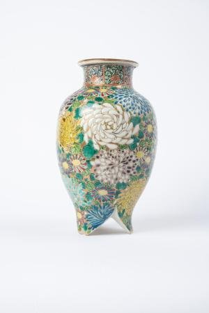
A Kutani Vase: Plucking Chrysanthemums in Autumn
Unidentified artist
Ao-Kutani Porcelain Jar
Japanese, late Meiji period, 1868-1912
Porcelain and enamel

This Kutani vase was spotted by two of my students during our visit to the Chapel Art Center last spring, and then attracted my attention and appreciation. This particular piece belongs to what is known as the “Green Kutani” (Ao-Kutani in Japanese) group, which uses Japanese pigment for the five Kutani colors of Kutani gosai: green, dark blue, yellow, purple, and red. The design of the chrysanthemums is spontaneously sketched in the five Kutani colors on the background of gold, with the feet on the vase touted distinctively. With quick and swirling brushstrokes contained in the thin, dark lines of the petals, the surface of the vase is elegantly divided by fine lines, dots, and a variety of small surfaces, yet all the elements are beautifully integrated, rendering a balance between dynamic movements of strokes and serenity. As a vase made for the European and American market, one can even associate its color and rhythm of the brushstrokes with the flavor of Van Gogh’s paintings.
The motif of chrysanthemum on the vase is a symbol for long life and endurance in the culture of Japan and China, as chrysanthemums would continue to flourish on cold autumn days when all the other flowers fade away. More importantly for most eastern Asians, chrysanthemums are symbols of a hermetic and pure life, which originates from a figure of the pre-Tang period in China: Tao Yuanming (365-427). Living in an era of wars and chaos, Tao had made a choice to give up political and social engagement, and went back to his own field to self-cultivate. In one of the poems from the Tao’s series of “Twenty Poems on Drinking Wine,” he writes:
I built my cottage in a peopled place,
Yet hear no sound of passing carts and horses.
Would you like to know how this can be?
If the mind's detached, the place will be remote.
Gathering chrysanthemums by the eastern fence I catch sight of South Mountain in the distance;
The mountain air is lovely as the sun sets,
And flocks of flying birds return together.
There’s an essential meaning in all this—I would explain it but can’t find the words.
The association of chrysanthemum and reclusion from the secular world has deeply influenced Japanese culture in many ways: literature, paintings, and decorative arts. One of my favorite writers, Natsume Soseki (1867-1916), in his novel Kusamakura (The Three Cornered World), discussed the poems of Tao and put this famous poem into the text, embracing the pure and simple world. Kutani ware has also incorporated the motif of chrysanthemum into their design since the old Kutani era.
As a gardener, I grew a variety of chrysanthemums when I was in Shanghai. In Japan alone, there are more than 350 types of chrysanthemums (“Kiku” in Japanese) with very different shapes, sizes, and colors. Autumn is the season when people appreciate the beauty and the fragrance of chrysanthemums. When I moved to New England, I, as a gardener, had a rather limited choice of chrysanthemums, facing only the choice of mums of small petals. It was such a delight for me to find this Kutani vase one day shining beautifully yet peacefully in our Chapel Art Center. It resonates with me in so many different ways: my cultural background, the visual memory and experience with different artworks both in western and eastern domains, and my own gardening and love of chrysanthemums are all embedded in that beautiful Kutani vase.
—Rong Huang, Ph.D., Associate Professor, Economics and Business
Sunrise Is Coming After While
Limited edition folio (oversize), bound with publisher’s purple silk, 1998
Langston Hughes, poet, 1901-1967
Maya Angelou, editor, 1928-2014
Phoebe Beasley, printmaker, b.1943

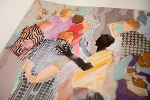
A true collaboration, Sunrise Is Coming After While (1998), is a striking part of the Chapel Art Center’s collection. It is a large, oversize, limited-edition book and case featuring poems by Langston Hughes, selected by Maya Angelou, and illustrated with six silkscreens by Phoebe Beasley. The purple-cloth-covered elephant folio case impresses from the first look with a beautiful and textural inset lettered leather title. The whole experience of opening and paging through the book is sensory: the velvet lining smooth on your fingers, the paper weighty to the touch, the words of Langston Hughes speaking across the large pages, breathing with the space afforded by the large size of the book, and emphasizing his poems’ clarity and emotional weight.
Beasley’s prints, like Langston’s words, remind us of soundscapes—of familiar domestic interiors, bustling city-living, and universal desires. Her use of wallpaper-esque patterns contrasted with layers of flat color make her figures extremely frontal, pushed out toward the viewer, and letting their voices be heard.
The frontispiece to the book is a colorful, dense scene of people embracing, talking, and gesticulating in a lively but crowded space. You can almost hear the chatter, overlapping and interrupting words, alive with the hope of the title, Daybreak in Alabama. The rest of the images have sonic qualities too. After all, they are accompanying poems meant to be read.
Beasley’s Aunt Sue’s Stories precedes Hughes’ poem of the same name that ruminates on the power of oral tradition within the history of American slavery. A black female figure holds a child and they turn to each other, as if in conversation, while a male figure sits nearby. The stories are being passed to the next generation while reminding those present of their past.
In Dream Variation, again, paired with a Hughes poem of the same time, Beasley captures the poem’s energy and passionate desire to live freely. She depicts a man in a suit, arms open wide, taking up nearly the whole width of the image, with a yellow, almost heavenly beam upon his hands that raise up high. Beasley is a master storyteller herself, clearly delineating and individualizing figures, yet reducing their facial features, letting them be symbolic too. In The Negro Speaks of Rivers, we see a man on a riverbank, looking up to the heavens in a cry for help. The colorful pyramids behind him speak to enslaved people in Egypt, but his desperation and pain seems to reach to their heights.
The Weary Blues brilliantly captures Hughes’ lines from the preceding poem: “He did a lazy sway…./He did a lazy sway….” Beasley shows a man playing piano, the left part of his body cropped out of the image and the right part swaying into it. The lampshade and blinds do a little wiggle too. The way the Blues moves the body, slow and deep, repetitive and profound—it’s all captured in the poem and print. Her last image, Mother to Son, is a call to action—a protest image. While the Blues may offer comfort, here, we see a woman in the street with a sign reading, “Don’t buy where you can’t work.” She insists upon her own visibility and rights.
Busy morning greetings. Generational stories. Hopes and dreams. Cries for help. Soulful music. Protest chants. All of these sounds pulse through the pages of a big, beautiful, loud book, a true treasure of the collection.
—Laura Shea, Ph.D., Assistant Professor, Fine Arts
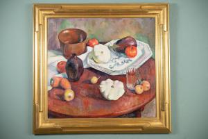
Still Life with Copper Bowl
Oil on canvas, c. 1925-30
Marian Harris, 1904-1998

I am honored to contribute to the celebration of Father Iain’s 25 years of building the Permanent Collection. One of my very favorite paintings from the collection is Still Life with Copper Bowl by Marian Harris, born in Philadelphia and trained at the Pennsylvania Academy of Fine Arts. It is a beautiful piece, fulfilling admirably the category Dilecta. Harris is clearly influenced by the impressionists, most obviously Cezanne in terms of the strength of her shapes and the flattening of the picture plane, and Manet in terms of the beautiful textures of color and paint.
To reflect on a still life is to focus on the formal qualities of a painting, on its beauty. The appreciation of beauty has a contemplative quality about it, and this painting invites the viewer to a deeper and deeper appreciation of the composition, relation of shapes, and handling of color.
A fundamental characteristic of beautiful art is that it is integrated order, with both symmetry and surprise. Without some symmetry, it would be chaotic; without surprise, it would be predictable and not invitingly fascinating. Harris’s piece fulfills both characteristics. Let me just point out a few elements of composition and the use of color that I find so beautiful.
The flattening of the picture plane—by such techniques as having the mouth of the copper bowl more radically tipped toward the viewer than the table and drawing the platter without foreshortening—emphasizes the decorative quality of the painting. Numerous structural components, both in shape and color, bind the painting together as a whole. Here are just a few of them. Through the middle of the painting, there is an offset cross in white, with the cloth and platter in the horizontal direction, and the white squashes in the vertical. However, this structure is not aligned with the frame of the painting but offset and so solidifies the composition. A circular structure ties all together, set up by the red and orange colors in the tomatoes, onions, and carrots; however, lest it be too pat, this circular pattern is nicely broken by the counter-directional curve of the carrots on the lower left and of the white cloth circling the copper bowl. Two diagonals, set up by shapes and colors, further binds the painting together: the copper bowl and the onions on the lower right (most similar in color) in one direction, and the pot and eggplant in the other.
One other thing feeding the viewer’s wonder is the way the artist integrates her colors by having them recur in a layered way in the background and the table. The warms (copper, red, and orange tones) and the cools (greens and blues) give the entire surface of the painting a delightful ambiguity.
The more I contemplate the painting, the more I see to delight me. It is a beautifully integrated composition of rhythmic shapes and rich colors.
—Montague Brown, Ph.D., Professor, Philosophy
For more information on the exhibit Ten Essays, please visit www.anselm.edu/arts/chapel-art-center.
